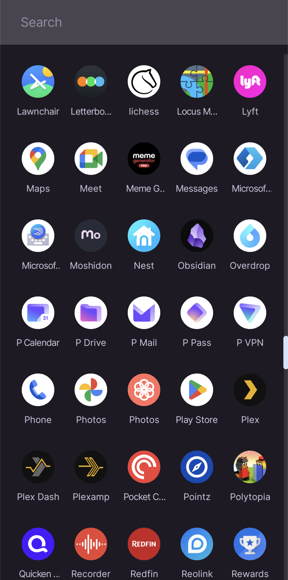
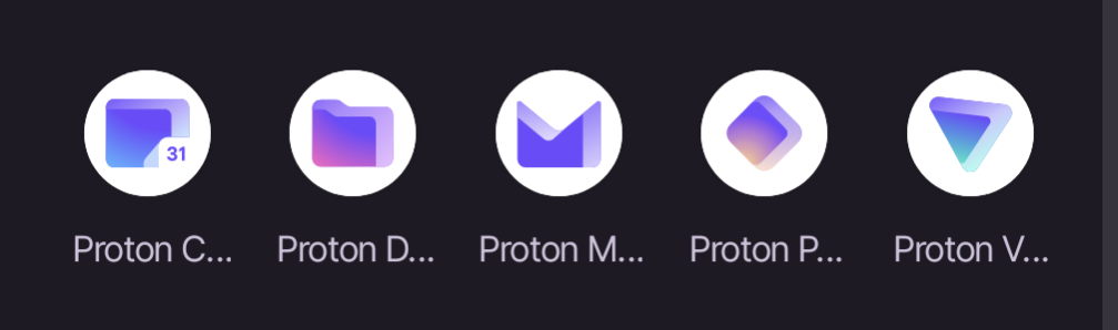
That the labels for the apps get truncated so you can only read “Proton” plus the first letter of the app. I’m only able to distinguish based on the icons which isn’t great because Pass and Drive are similar colors, and Pass and VPN, and Drive and Calendar are similar shapes.
You must log in or register to comment.
Just as annoyed as I’m with Google’s branding icon designs.
A new note app is incomming !..
I don’t really have any apps on my home screens or my desktop pages.
I have them into groups on mobile and I just pull them up from the start menu on desktop
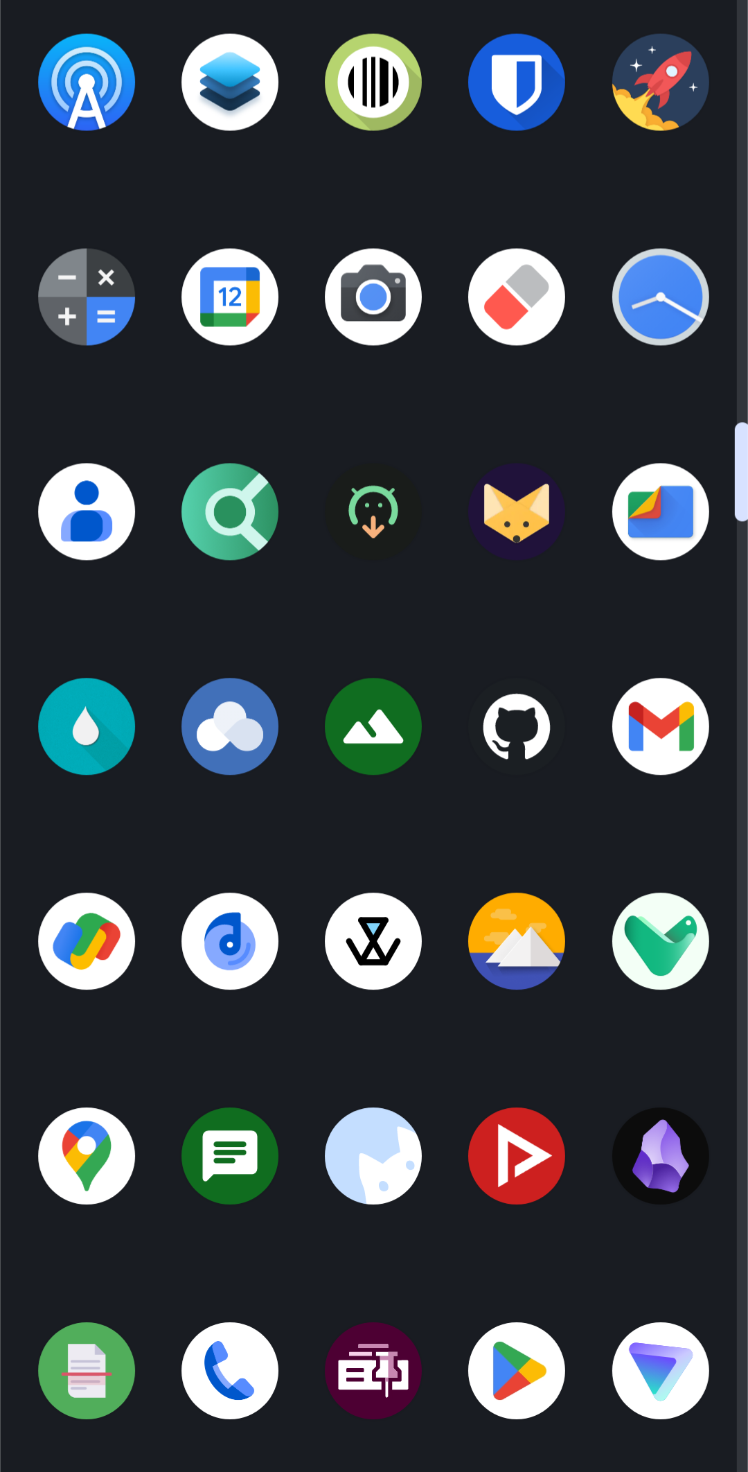
Im trying to figure out why the icons all need a white circle behind them.
All of my icons are circles. Are yours not?
I was just commenting about how it’s half-assed design to just slap an existing icon against a white background and call it a day. Compare to the lawnchair icon, locus, or even the Lyft icon in your screenshot. You find the names annoying, I find the design laziness annoying. Companies do it on iOS as well (including Apple).
I imagine part of it on Android is for adaptive icons https://developer.android.com/develop/ui/views/launch/icon_design_adaptive
As with all your other questions, it depends on your Launcher
The icons can be hard to distinguish, on the fly.
Yeah I noticed this as well, they are too similar and sometimes I open the wrong one by accident
I am always doing this with Proton Mail and Calendar.
What would you like to use today? The proton square? The proton rhombus? Or the proton triangle?
On many launchers you can enable two lines for labels, so you don’t have to manually rename them.
And you can rename the labels. Or remove them completely and just rely on the app icons.
My solution -
idk why they shoved it right in the start, i mean i just want to check my mails man, if i want to check out proton drive or other stuff i will access them from the side bar or menu. kinda annoying move.
Yet another reminder of why I love the Niagra launcher so much.
This app may share these data types with third parties
Location, App info and performance, and Device or other IDs
This app may collect these data types
App activity, App info and performance, and Device or other IDs
Why?
Yeah, especially seeing how on others like Lawn chair I can edit the name myself
Not sure what the screenshots are from, but is it not possible to rename the icons for legibility?
Wow, I didn’t know you could do that. I’ve always used the Pixel stock launcher but just recently installed Lawn Chair. Don’t know if every launcher allows you to rename or not.
So when I rename they re-sort alphabetically so I’m renaming to “P Calendar”, “P Mail” etc to keep them together. It’s a little clunky but solves my problem
Did the same.
I’ve been using Niagara Launcher on my S10 / P7P with only a handful of icons on my home screen.
The majority of programs I swipe up for a search bar with keyboard. I find it much faster than swiping homepages / folder to dig up a program to launch.
Now that you mention it… Yeah! I rename the icons to just “Mail, Calendar, Etc…”
On the other hand, when I install a file manager from Fdroid. It’s renamed to something generic that’s hard to tell apart from the factory installed apps.
I’m more a visual person. The icons are all I look at.
But all the first letters are unique. So that should work well enough, no?Proton Cunt
Proton Dick
Proton Mouth
Proton Penis
Proton VaginaLol, Lemmy…
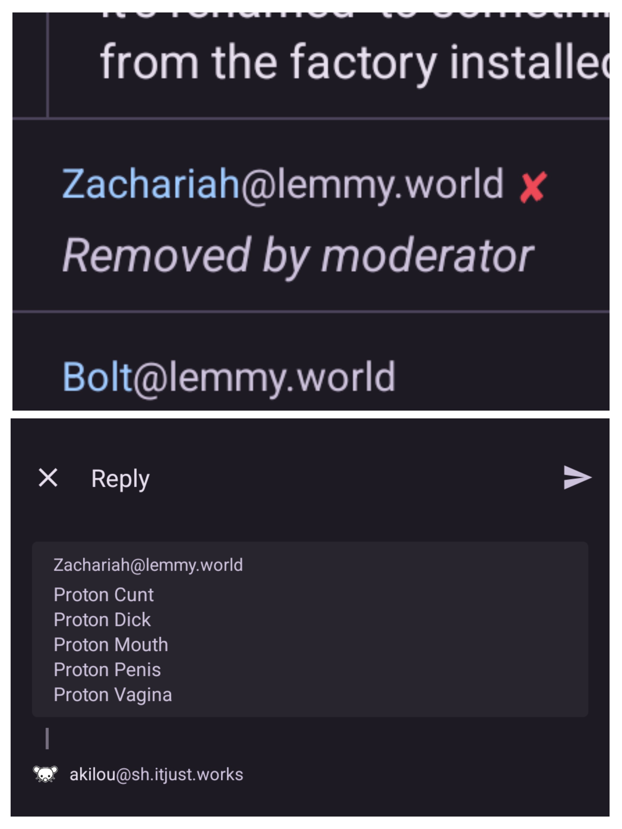
🙄
we are not 8yr olds, mods.
That needs to be acted, not said.
i’m not that mature but i’m pretty sure i’m not 8 and i know what swear words mean.
we are, yet we aren’t
shcrodinger 8 year old
They really be removing anything huh
There are certain rules, we all expect you to follow them. Come one, that one wasn’t even contributing.
.world moment
Some icon packs still include the old Proton Mail lock icon 😀
Generally an issue I have with a lot of apps unfortunately.


