

- cross-posted to:
- [email protected]
You must log in or register to comment.
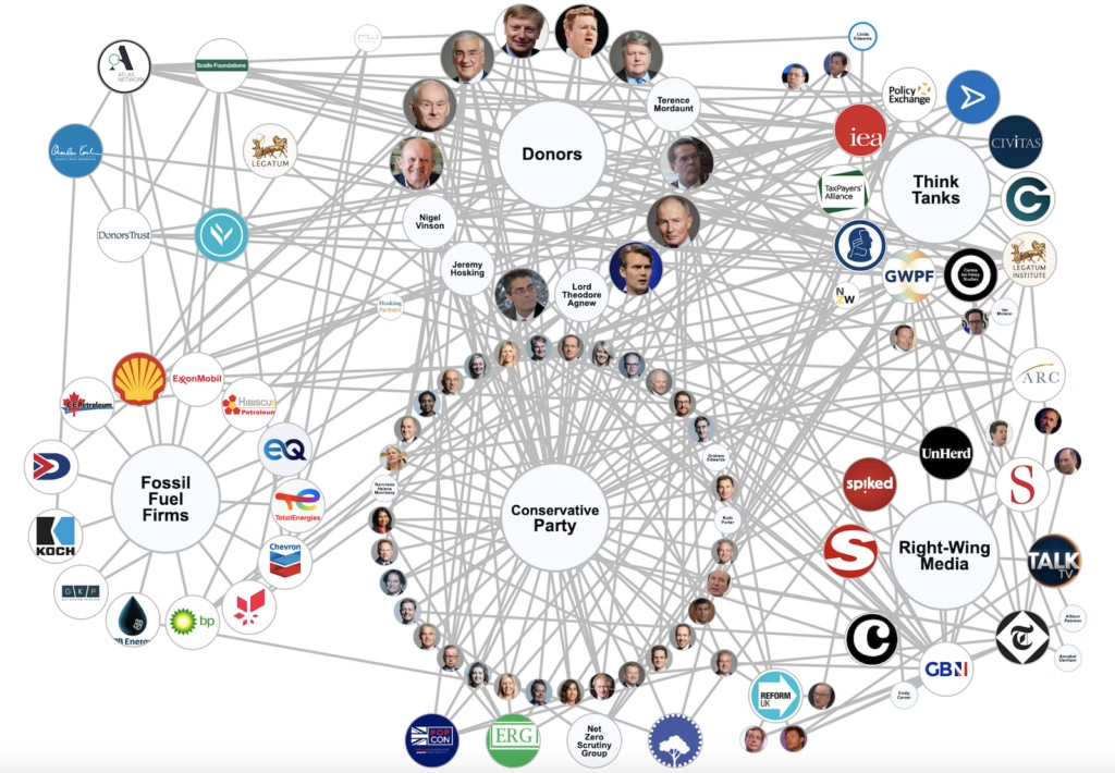
It’s important information but not really a very beautiful or useful way of presenting it.
The lines coming from the label nodes add a lot of unnecessary visual noise. I think it’s already pretty clear what’s what based on the circles this graph is arranged into.