Oh, that’s nice. I guess… That must have been cut off when I originally saw the image. The issue with stuffing that information in the corner makes it less likely for someone to actually parse that information along with the main part of the infographic. Especially considering it’s right next to where they gave a footnote to another company, but not for Brave. That’s rather inconsistent and makes it even more disconnected from the main part.
I’d prefer if Brave itself was stuffed into the corner along with the note.


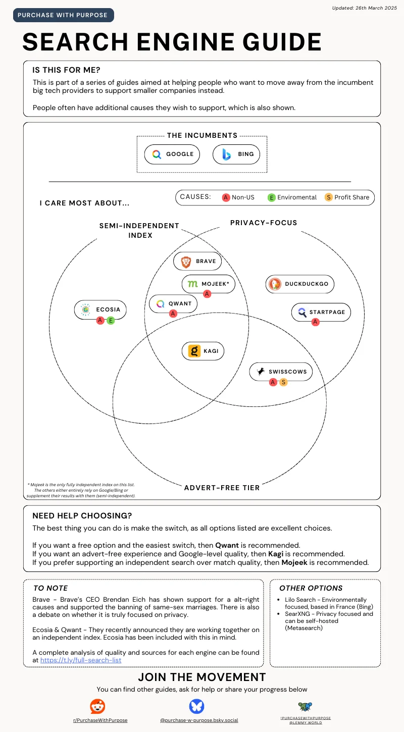
There is a “TO NOTE” section in the info graphic. It’s literally in there.
Now off… $fscking myself.
Oh, that’s nice. I guess… That must have been cut off when I originally saw the image. The issue with stuffing that information in the corner makes it less likely for someone to actually parse that information along with the main part of the infographic. Especially considering it’s right next to where they gave a footnote to another company, but not for Brave. That’s rather inconsistent and makes it even more disconnected from the main part.
I’d prefer if Brave itself was stuffed into the corner along with the note.