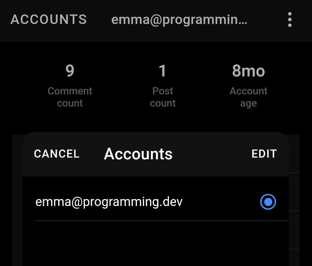
The ACCOUNTS title has been capitalised while every other title on other screen has the first letter in uppercase only. This only happens when choosing the android theme. Choosing the apple theme seems to be fine.
The android theme has been improved but having this capitalised makes it look jarring.
Voyager v1.45
For reference, this is the apple theme.

All caps is a material design thing. ACCOUNTS is a button in this case, not a title. I’m assuming (although my knowledge is limited because I just downloaded the app) that this is intentional as material design is kind of the default Android look.
The same style is applied other places such as the “CANCEL” or “EDIT” buttons displayed here, so it isn’t just one place.

To be clear, I don’t know if they are following material design to a tee, but I do believe they might be taking inspiration.
This should be fixed next release.


