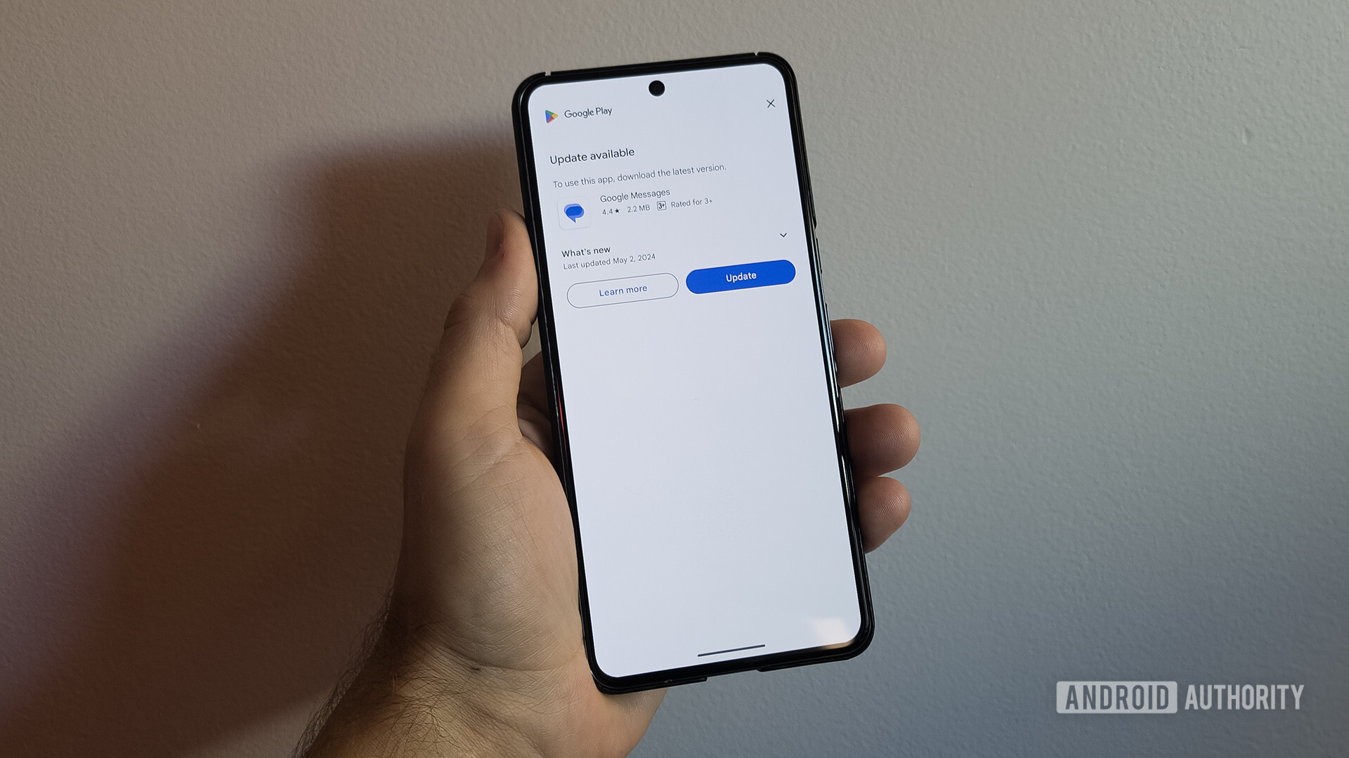
There’s a new Google Messages update page that takes up your phone’s entire display every time you open the app.
Granted, keeping your apps up to date is important, and this new system will help get that across to users. But we’re not sure annoying the hell out of the user about it is the best strategy.


Removed by mod
People on metered connection and low connectivity areas are probably going to more inconvenienced by this force update banner. Unable to use your message app because you forgot to update and now cannot connect to the internet.
I’m sure if you swipe down from the top, the menu will stop drop down
The problem is that sometimes they choose that, and then they pitch a fit at you when their out of date software becomes the point of entry that’s lead to them needing to figure out how to buy and trade crypto.
Software is made for the lowest common denominator to be able to use, and that means hand holding and railroading for everyone else, or else we get dumbasses who some the fuck how managed to backgrade their OS to the original Windows OS and are now exposed to literally every security risk that has been invented since that was released.
Don’t protect me from me or you’ll be protecting you from me next.