

You must log in or register to comment.
Here’s another version
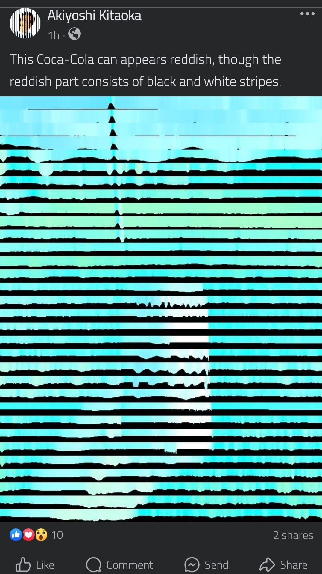
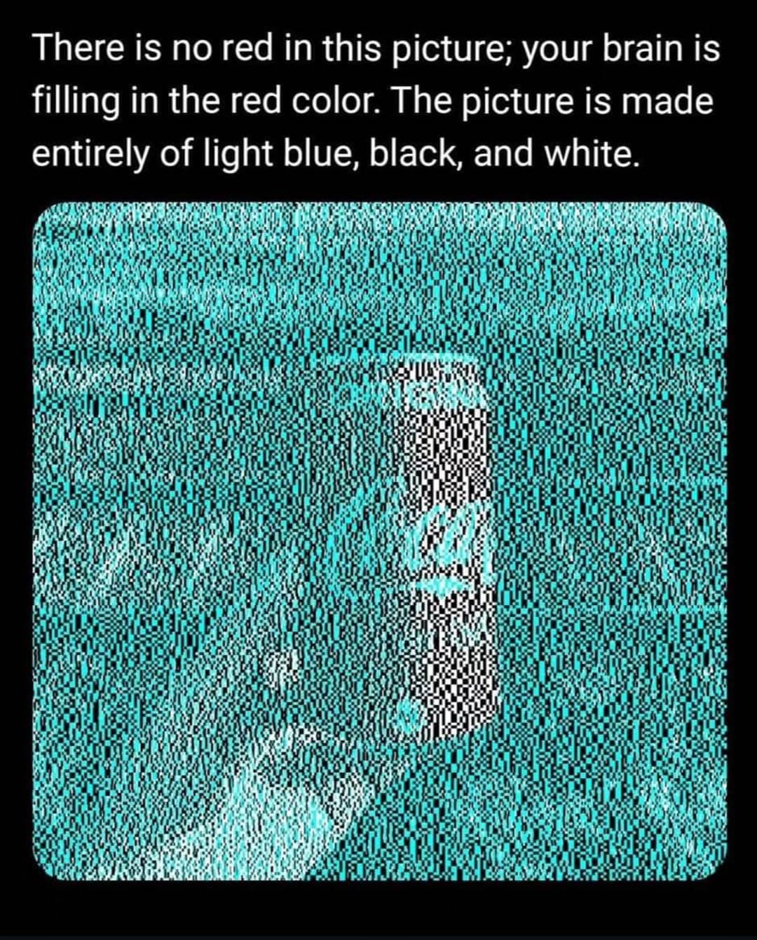
The poster in the image is the original source for the coke can op posted btw
…I was gonna say it took until it was shrunk down to the thumbnail to see red, but nope, it actually has red in it in the thumbnail.


Guess this is specific to how often you see cans of coca-cola?
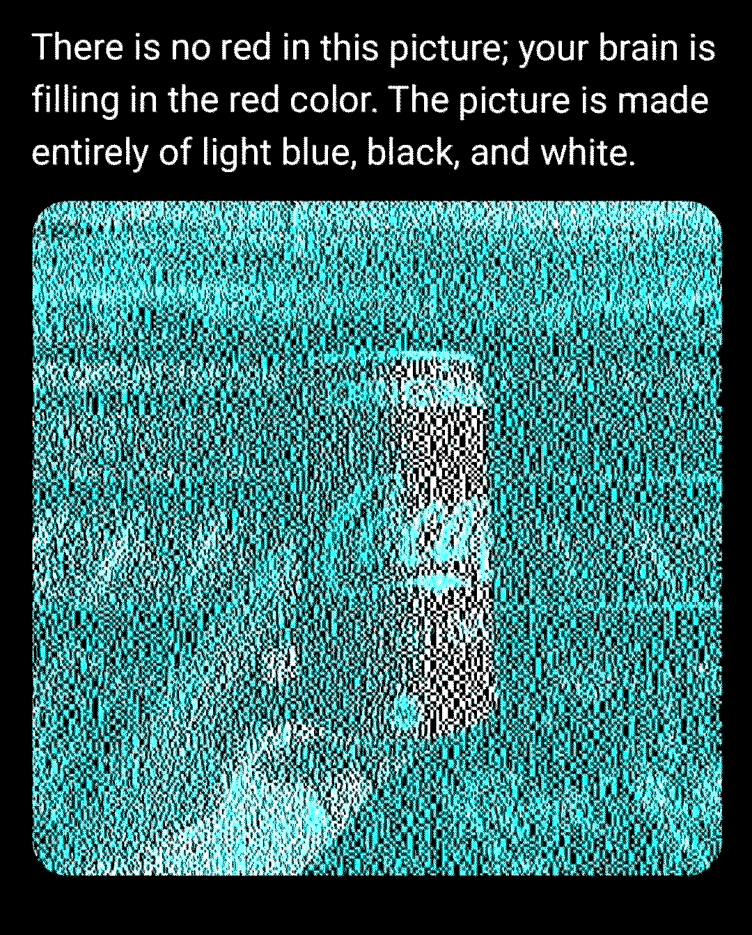
Here, I put the image through a ditherer (only available colours are black, cyan, white). I don’t see any red at all now.
[edit}
Actually, that “red” is mostly just gray so I played myself here. Still, the luminosity must be closer to red before I detect it as red, white doesn’t do it.

Red is complimentary to cyan.
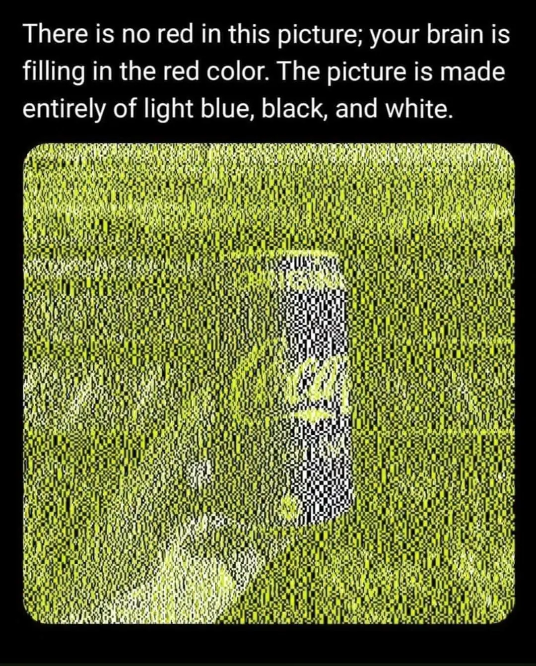
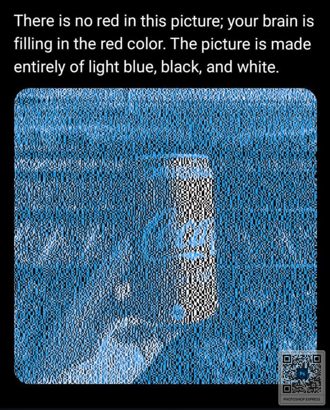
If the cyan were switched with yellow, the can would appear blue.
Also, it’s not our brains creating the red, it’s our eyes. They get exhausted of seeing the cyan and replace it with red.
He’s right.
You guys never cease to amaze me.
Can you do that and post it?
Well color me impressed.
Colored impressed; appears pink.
fun fact: pink isn’t a real color.
I believe you’re thinking of Magenta. Pink is just red and white.
What??
It’s a real color (as real as colors can be, which is not very). It’s not a spectral color, you won’t find it on the rainbow. It’s actually the result of your red and blue cones being activated together.
so this is based off my memory so there could be inaccuracies.
but what i’ve heard is that pink is the result of your brain registering a color because of specific color cones being activated but that your brain knows it’s not actually that color and so it fills it in with pink.And so is brown.
Pink is actually GREEN!
Grab your pitchforks gang. OP is selling us snake oil posts!!!
Now send this version (with the same unedited caption) to everyone.
Strange, I see the OP picture as red, but this one as black & white.
so it would appear red even if it was another can?
yes, obviously
It’s curious that the thumbnail actually has red values for those pixels, making me think they’re cheating a bit with jpeg compression effects.
Huh, it shows up as black to me.
It depends on the size you are viewing it at. This works well on small screens but less well on large screens
Let’s hope it’s the size of the image and not the responding user’s revelation they are red green deficient lol
So if the can shown wasn’t Coke, but Sprite, it would still appear red? Or is it a mix of both? The eyes are confused and the brain fills in? Like when seeing pink as mentioned elsewhere.
Your brain isn’t filling in anything. Your blue and green receptors get oversaturated by the cyan, which causes your red receptors to be more sensitive to the white light than the other two, which is why it appears red. The effect happens in your eye, not in your brain.
I think there’s something more going on here than just “marketing”. Because if you look at the tiny thumbnail in the OP it’s very clearly red, and you can even load that thumbnail into an image editor and zoom in to see slightly reddish pixels.
So something happens when scaling this image that actually results in a red hue, and I don’t think my computers image scaling algorithms are also falling for “marketing”. I would guess it’s actually some kind of sub-pixel trick that makes it seem like there’s colors there which aren’t, and that’s why the image scaling algorithms also reveal the same colors you see.
It’s not marketing, just colour theory. The same idea has been used by painters for ages.
It is when you use cova cola instead of, lolipop, santa, flag, flower or some other red object.
That’s so weird. You can stare at a pixel and go “yep that’s red”. Zoom in, still red. Zoom more, BOOM IT’S BLACK!
The “red” parts are white, but yeah it’s interesting
I am confident that is not correct, but every time I zoom in to test it, my brain explodes and I can’t tell.
I’m also lost. Because logically it should be the white, but I see a red and white striped midsection of the train and a red and white flecked can, so I think it must be coming from the black pixels.
Why is my brain making the train stripes red? I don’t know what color they normally are, which I assumed was the mechanism behind the coke can illusion.
Because our brains interpret colours and shading relative to their surroundings. That specific blue is on the opposite side of the colour wheel from red, so that relative lack of blue can be interpreted by our brains as red.
Remember that white is all colours present, so white next to white will have more red than white next to blue.
You’d get a similar effect if you stare at a bright blue version of the can for a while and then look at a blank white page or close your eyes. The after image isn’t the same colour as the thing you were staring at, it’s the inverse of that colour.
Nah, it’s still colour theory. Now it’s yellow, magic.
As a video editor, fuck Adobe lol
I’m right there with you, I just downloaded the first app I thought might let me shift hue.
I installed GIMP on my Android phone for changing aspect ratio of photos, but used it for hue, too
didn’t know it was on phone, thanks for the tip!
No judgment for using the tool you used. I just always feel a need to say fuck Adobe lol. Recently got our production team fully in resolve, but unfortunately there is no suitable replacement for adobe audio enhance tool yet. Hoping resolve’s voice isolation tool can eventually supplant it.
Jokes on you I zoomed in and out on the original and now the can appears white no matter what.
Its the second Coca Cola TM post ive seen since I joined lemmy.
The other one was yesterday.
Still red with no logo.
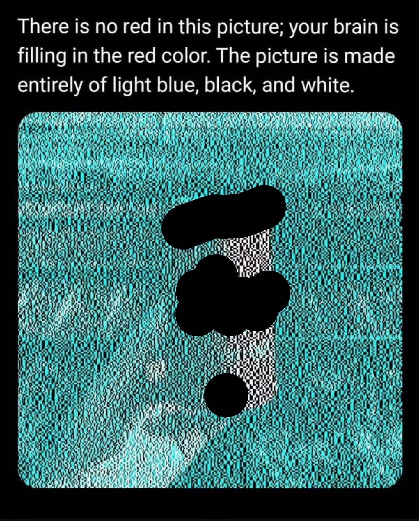
White light has red in it. Cyan does not. We fatigue blue and green cones everywhere but the white can, and we only stimulate the red cones on the white can. The result is it looks red.
Thank you. I thought this was going to be like the dress.
The white and gold dress, you mean?
Exactly
Oh weird, I assume this is just because the white is relatively red compared to the cyan, right? As in if you took any image and coloured it in the same way then it would also look red.
Yeah, there seems to be a lot more going on here than just marketing. If you mask the logo, the red still works. I believe it has to do with the combinations of white/black, white/cyan, black/cyan and the relative size of the blocks to produce a red hue through complimentary color persistence or whatever it’s called.
Hand doesn’t look red tho
The hand has cyan in it
Brain uses expectations to decide what to fill perception with. you don’t expect hands to be the same red tone as cola cans.
I think it’s also the amount of blue overlay. If you zoom way in, the cola can has much larger chunks of uninterrupted white, whereas the hand has a lot more blue interspersed.
Fair point, well observed!
Your mind compensates for the teal which makes the white look red.
It makes gray look red because it’s similar luminosity. White still looks white.
then why are the other parts still white
deleted by creator
The image has teal-black parts and white-black parts, the white-black parts look like they’re red-black
I’m colorblind this trick doesn’t work with me
Jokes on you, I’m moderately red green colorblind so I wouldn’t realize it if there was red present
Do you see the Coke can as a different color from the background?
I’m red green colorblind as well. I just see the background as white or a very light shade of grey. Someone else has made a post with a yellow can and in that one I see the background as yellow (which is basically the same as green to me, I have very little r in my rgb), especially the right side of the can.
Same here. Those colour fanatics are fantasising again I suppose.
Nonsense. My phone screen uses red, green, and blue to make up each pixel. The white pixels have their red component all the way at full brightness. Therefore there is a lot of red in the picture.
You could also see this by opening up the image and looking at the red channel which would not be completely black.
Texts on computers is made this way, so use a magnifying glass on black white text in a word document (for example) and you’ll see lots of colors. zoom in using the computer and you will still just see black/white.
So that’s why I can’t print greyscale documents when my yellow ink is too low!
Ha ha nah thats because all (color) printers also print a unique pattern with yellow, so that anything from your printer can be traced back to it
Can plz anyone find a link (am at home with wrecked right arm)?
Yeah, that was the point of the joke
But you’re right, better leave a link, the more people know, the better
I just tried printing this image but it says my magenta is too low 🤔
It’s actually all just white light at different wavelengths, which tricks your brain into seeing different “colours”.
White light is the combination of all those wavelengths. It is only the combination that makes it “white” in exactly the same way that a smaller range of wavelengths are “red” or “blue”.
Making your brain do exactly what it’s supposed to do is a weird way is “tricking” it.
no actually it’s white light with different phase shifts and because the earth is flat, the surface temperature of the sun tricks your brain into thinking it is red
When its small thumbnail I can see it but when I look at the full size image I appear to be able to turn the effect off at will.
If I zoom in just a bit it’s white, turns instantly red at some point of zooming out.
The tipping point is wild
That’s wild as fuck. If I actually concentrate on the “red” it becomes white and then only becomes red again if I look away for a moment.


