
You must log in or register to comment.
i’d like to have a graphic design community on here
I second this.
ps1_bootup.nostalgia
Godel, Escher, Bach did it first, but even cooler.
Likely inspired the design.

Humans are so friggin creative I can’t stands it.

Yeah you know me.
Now, for the ladies, OCP means something different.
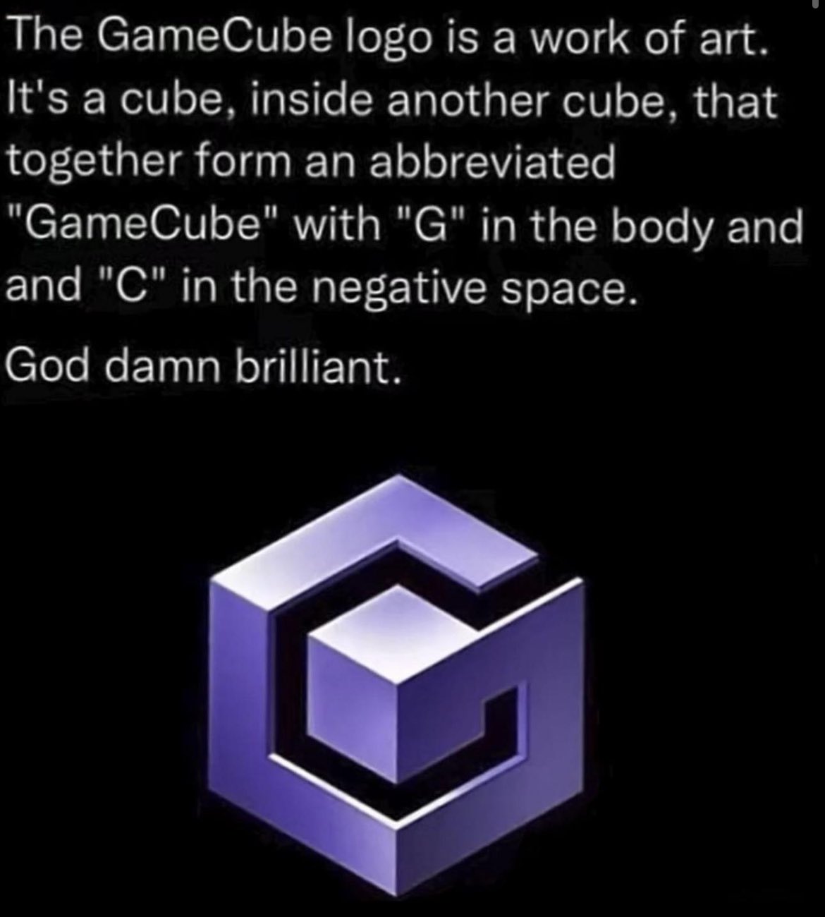
This one or the N64 logo (with its 64 faces) is the greatest real logo
I don’t see how the N64 logo can have 64 faces. I counted 24 faces.
I’ve just looked it up, and it seems to just come from a Reddit post where they explain how they’ve worked it out, but in their working out they’ve triple-counted the N-shaped faces.
Probably the actual 3d representation does
Didn’t realize it had 64 faces that’s cool af
Not to mention all the memes it spawned.
Kinda related -
The logo of Annecy, capital of Haute Savoie -

Why it’s so clever - the flag of Haute Savoie -
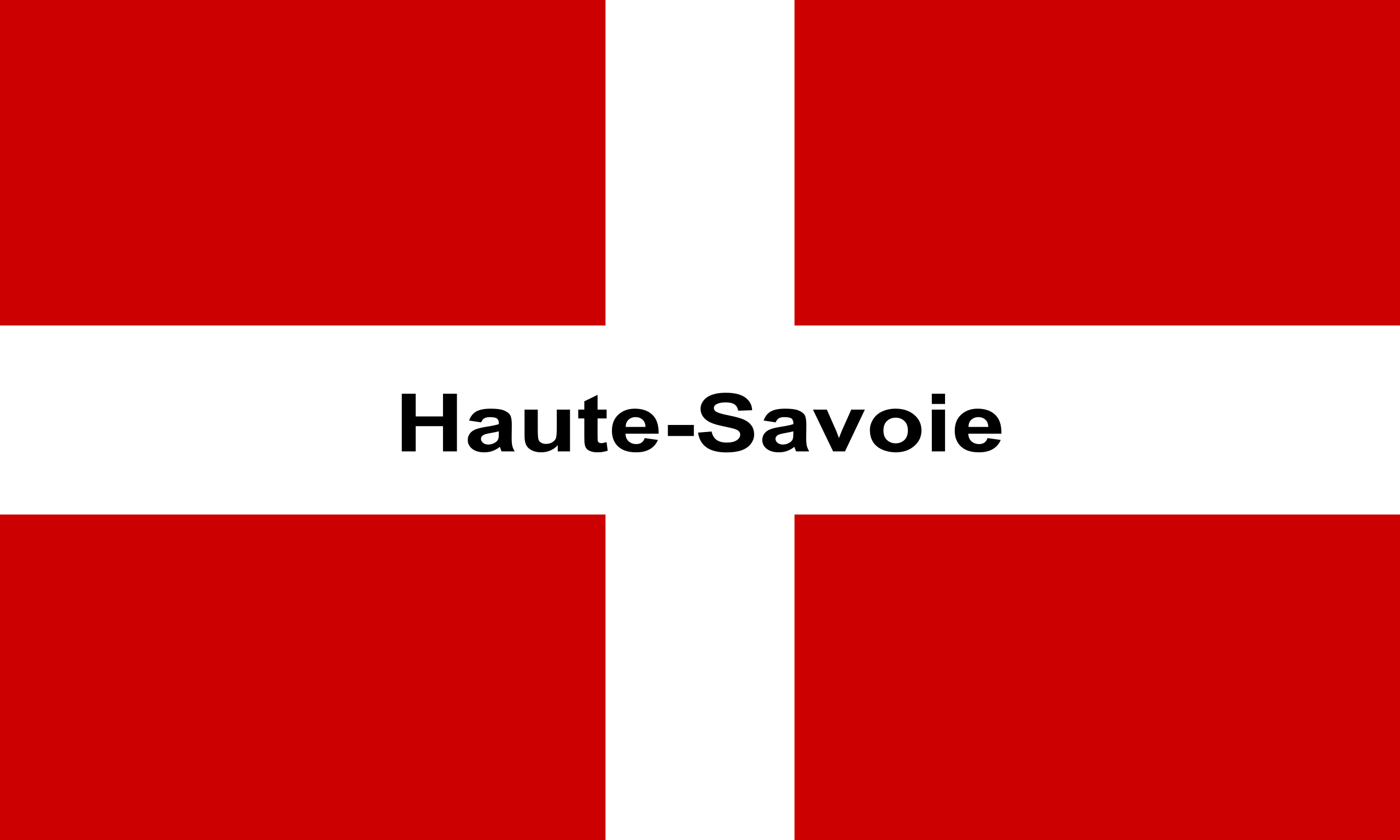
Edit, forgot to add, the Swiss flag has red gaps at the ends of the white cross, in case you were wondering
Damn that’s actually clean af
Some random guy in a remote part of France is an amazing graphic designer
Also good to know that haute Savoie is the most Swiss part of France so the similarities are no coincidence (I assume).
It’s literally right next to Geneva

“I can’t wait to see their next brilliant logo design!”

ಠ_ಠ
My brain just did some work. Now I can’t unseen this as that manly handshake scene from Predator. The two 'i’s are the guys, and the ‘W’ is a zoom-in of their handshake.
That whole era had really shitty design. “Sleek this, minimalist that. Only black/white/greys allowed”. Got old real fast.
Just wait until you see the sequel to this one.
(╯°□°)╯︵ ┻━┻
But the “ii” part bows to you! Its revolutionary!
Oh I thought that was like “we” cuz you play alone most of the time.
Random Nintendo execs show up to your house unannounced.
“We would like to play”
You stare at them blankly for a beat then shut the door in their faces. This is your time away from the world and its demands. No one will take that away from you.
I still contend that the GameCube controller is the best designed controller on the market in terms of comfort and usability.
The C-stick and Z bumper are the two big weaknesses. If it had a proper twin-stick design instead of the C-stick nub, and actual bumpers that felt good, it would hands down be the best controller ever designed.
Steam Controller was peak, don’t @ me
Currently playing Armored Core 6 with a Steam Controller, and I love it. But… the right track pad leaves a lot to be desired.
The best aspect of the Steam Controller, without a doubt, is the modularity and shareability of it. The standard control scheme a game tries to assume, most of the time it stinks. But being able to browse through community-made control schemes and finding one that works for me is fantastic. The highest downloaded control scheme for AC6 got me 95% of the way there; I just had to change the bindings of the back pedals to suit me. Now it uses the track pad and the gyro in conjunction-- track pad for big sweeping movements and gyro for small adjustments-- and I love it.
The haptics are great on it. But the pads aren’t good replacements for sticks.
I can’t play souls games on anything but a steam controller. The pads are so much better than a stick for camera movement, and the pads are incredibly useful with the games’ awkward layout for sprinting.
Depends on the game. I couldnt play bg3 without pads. Really need both.
I think steam controller has some shortcomings. Deck definitely has better controls.
Generally, but it has some issues. I found the C-stick to be very uncomfortable with the lack of a cap, and you can’t really press two face buttons at the same time unless one of them is A. The latter isn’t usually a problem, but certain games, like the Arkham series, would be virtually unplayable. That there’s only one shoulder button on one side is also pretty weird. The dual stage triggers are pretty neat, though, and the only other controller I’ve used with them is the Steam Controller, which has a pretty steep learning curve.
Yeah, figuring how to roll my fingers among the face buttons to do fancy stuff in Metroid Prime was tricky. I also like to use my thumbs to reach across the controller to the dpad and c stick on the opposite side so that I can change visors while on the move, for example.
Yeah, it shows just how good of a game Metroid Prime was because it was still amazing despite very awkward controls.
Using different sizes and shapes for the buttons based on frequency of use (and to help new gamers not have to look down) was a really smart idea.
Nintendo take down of this post in 3…
There are a couple of men in monogramed red and green hats at my front door. Should I open it?
Just tell them you’re in another castle
The Peach Maneuver
Now that’s clever. Nicely done
Wait til they hear about the arrow in the FedEx logo
It’s too derivative of the N64 logo if you ask me. Jk, they’re both pretty good.
The N64 logo was equally as creative maybe even more, with its 64 faces and 64 vertices.
“This work of art, created by a corporate graphic designer for a video game system, is a work of art, created by a corporate graphic designer for a video game system.”
Fascinating.
I love when people attempt to gatekeep what constitutes art.
Quote me where I say it’s not art, please.
I mean, it’s not disqualified from being art just because the artist got paid by a corporation. Historically most great artists were paid by monarchs, religious leaders, nobility, or wealthy merchants, who were all the power brokers of their time.
But yeah the fact that this is a product branding logo has weird “hail corporate” vibes.
I mean, it’s not disqualified from being art just because the artist got paid by a corporation.
Please quote me where I said that it was.
But yeah the fact that this is a product branding logo has weird “hail corporate” vibes.
That and the fact that the observation itself is somewhat facile.
I’m honestly not sure what you expected by clicking on this kind of post or what point you’re making. Of course it’s facile.
You doing okay today?
There are some outliers on here today that are especially special.
I’m honestly not sure what you expected by responding to this kind of comment or what point you’re making. I’d also ask you if you were doing okay if I felt like being condescending, but I’m not in the mood for it.
Why are you even here?
Well my initial goal was pointing out how stupid OP’s post was but now that you’ve decided to engage with me I’d say it’s because of your positively magnetic personality and my near pathological need to bicker with people on the internet.
Do it somewhere else.
How is the post stupid? Yeah, you correctly identified that it’s a corporate logo/art work. It’s still interesting and clever the design that’s gone into it.
I can hear this picture
I have the GB color, gamecube and og xbox intros set as boot intros on my steamdeck. Always a neat thing to look at.
Now I’m holding Z. Can you hear the difference?
Now I’m holding Z on all 4 controllers!
Now I’m holding Z on all 4 controllers.
I only recently learned about this one!
I don’t remember anyone passing this trick around back in the day. Maybe because most people didn’t have 4 controllers?
was there a difference?
Yeah, you could hold the Z button at startup and it would make squeaking sounds instead of the normal thing.
i have never seen that before, til!
🐁🐁👶


