- cross-posted to:
- [email protected]
- cross-posted to:
- [email protected]
You must log in or register to comment.
Looks really cool for what it is, but:
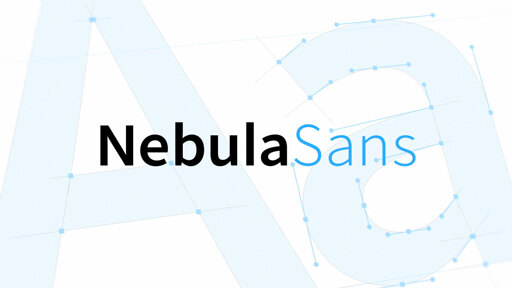
A versatile, modern, humanist sans-serif with a neutral aesthetic, designed for legibility in both digital and print applications.
What does it mean to be a humanist font?
It doesn’t refer to a characteristic of the font, but to a category.
Edit. Now that I look at it, maybe they are using that word a bit too freely?
Here’s another guide describing some of the different types of fonts :)
https://www.monotype.com/resources/guide-type-styles
Some are named after specific designers who originated the style with it becoming a design trend and spawning new similar designs. (Like the Didone fonts, named after the designers for didot and bodini)
Others just originated in a particular time period where certain features were considered fashionable or typical for type designers, with many of the new fonts cropping up sharing similar characteristics (like humanist, which was sort of the modernizing evolution of “blackletter” typefaces that were the original style typically used with the printing press) Black letter is very ornate traditional caligraphy, usually with lots of contrast in line weight (some lines much thicker and other lines much thinner), and humanist typefaces are also styles after caligraphy, but much simpler and more reserved
From the linked website:
Humanist
The first Roman type was derived from calligraphy, so the shape of letterforms is based on formal writing with a flat brush or a broad nib pen. The term Humanist has traditionally been used for serif typefaces, but nowadays there is also Humanist Sans.

(Full acknowledgement I am very much a layman so take all this with a grain of salt, this is my understanding, but I hope it helps!)
@[email protected] @[email protected]
I read what both of you linked. To be perfectly honest? I still don’t really get it. Kinda seems like it’s called humanist just because?
The first Roman type was derived from calligraphy, so the shape of letterforms is based on formal writing with a flat brush or a broad nib pen. The term Humanist has traditionally been used for serif typefaces, but nowadays there is also Humanist Sans.
Today we’re going to take a look at just one of those terms, namely “Humanist”. You may have come across this term before (or you may even be thinking, what the hell’s that?). The term Humanist is part of the nomenclature that describes type classification. During the 1800s a system of classifying type was derived, and although numerous other systems and subsets of this system exist, this basically is it: Humanist | Old Style | Transitional | Modern Slab Serif (Egyptian) | Sans Serif
? ??? ?
Yeah I’m not actually sure where that specific term came from as a descriptor for that kind of typeface. It might just be that someone decided to call it that because they felt it expressed their reason for designing in the way they did
Perhaps they felt moving away from the formality of blackletter felt more accessible at a time when not everyone could read, and was more “human”
🤷♂️
Probably just gonna do my best not to think about it too much. Like I said to @[email protected] this seems like a thing that could take all my free time for the next few weeks, and leave me disappointed with no real answers. 🤷
Yeah, looks like they weirdly happened to want to describe their font like that unaware that the word already had a concrete meaning in typography context.
Have the feeling this might be one of those things where I hyperfixate, do a deep dive, and never get an actually satisfying answer…
There is at least contrast, as in variation in line width like you’d see in caligraphy, it’s just very subtle. But yeah if they’re using humanist font design features it feels like they’re using them very sparingly and in extremely subtle ways
I’m no expert but I see what you mean 😅
edit: wrong place to answer.