Hey everyone! Thanks for participating in Canvas. I wanted to make a thread to collect together suggestions people have that can be worked on before the next Canvas.
Feel free to also throw in suggestions for future Events we can build and run for the fediverse.
Ill be collecting suggestions together and making issues for them in the repository for myself or some other contributors to work on (the projects open source so anyones free to contribute! https://git.sc07.company/sc07/canvas Feel free to reach out to me and I can help get you set up with the codebase)
I’d be keen to run/test a local version, what do I need in the .env.local as a minimum to get up and running?
there’s an issue to write instructions on how to setup the environment
the server requires the authentication server to be fediverse-auth with the current implementation, but there’s an issue to add support for other providers
(once the documentation is written i’ll be putting it in #canvas-meta:aftermath.gg to keep people in the loop)
Yeah, I figured as much. I put it on the backburner as I was wetting up a selfhosted scratch instance for the girls
It looks like the compose file has
REDIS_HOSTandDATABASE_URLand point to included services. There’s also a few in the dockerfile for settingPORT(3000) and some node stuff I don’t understandTo get it actually running you need to do more than set up just the env but ive got what I needed to do here
https://share.ategon.dev/u/IzcMWM.md
If you want to allow logging in so you can test the features that get unlocked from that heres some code changes to get it working so you can bypass setting up openid
http://share.ategon.dev/u/W7IODE.md
Client will be up at localhost:5173
Escalating timers are an antipattern. It punishes anyone who looks away for more than thirty seconds - and thirty seconds per click is not exactly a brisk pace for maintaining attention.
Other than that, good shit, well done. Undo was a welcome surprise. Ditto the repetition prevention.
No wait, one other thing. (Complaint sandwich!) Scaling should be in integer powers. Everything but fully-zoomed-out and extremely-blown-up looked lumpy and distracting. Especially with all the pixel art going on.
I like the escalating time, but the pacing issue is a fair point.
So perhaps the escalation could be delayed? Give it a tiny larger timer (let’s say, 40s?), and make the second pixel take as much time as the first. Like this:
- current times - 30s, 60s, 90s, 120s, 150s, 180s; total 630s
- my proposal - 40s, 40s, 80s, 120s, 160s, 200s; total 640s
This way you’d be only getting less pixels per minute after 80s of inactivity, not 30s.
Longer waits would be worse.
It should be one every thirty seconds until you hit some limit. Do not incentivize continuously staring at a timer. Do not incentivize obsessively checking a timer. Just rate-limit people in the simplest way that could possibly work.
I get why you’re saying this, and I agree with base reason. However, I feel like fixing the problem by removing the feature is not the way to go, as I think that active playing should be rewarded.
Regarding the base time (30s vs. 40s): I proposed 40s because the total waiting time would be roughly the same. It could be also 20s, if necessary/desired, up to the devs.
Additionally it would be great if there was an audible “ping” once you get a new pixel. Then regardless of the timer or how it progresses people would feel freer to do other stuff while checking the canvas.
One literal pixel every thirty seconds is not “active.”
You went people to drool when a bell rings.
Encouraging users to obsess or react is plainly an addiction mechanic. In a collaborative MS Paint session. Tweaking the details of it misses what’s wrong with it. It’s an antifeature. It’s a mistake.
Just give people one pixel every thirty seconds. “Active” means they check at least every couple minutes, at their convenience, where they will have up to six. If they step away for an hour they don’t get hundreds.
thank you (and everyone else in this thread) for the constructive feedback!
i’ve added the timers as an issue in the tracker to help with keeping track of everything
i think i got the main points given in this thread, but if theres something you think is missing feel free to reply to this so i can add it 👍
i’ve also added the weird zooming issue also
So much went right that all the negatives are nitpicky.
i’m glad :) it was very fun to run after all
I think it was 30s between every pixel at the start.
It was sort of, but it was a bug. If you just left them, you’d get one every 33ish seconds until you had 6. But if you had 2 then used one, you’d have to wait 66 seconds until you got another, unless you used your last one then it was back to 33.
It was fixed partway through to be as originally intended.
One effect of this is that someone steadily editing got more pixels than someone editing in batches, which felt like a feature when defending against trolls.
Encouraging anyone to stare at a screen for two actions per minute is brutal. Especially when those actions, to be optimal, have to happen the moment the timer rolls over.
This is an addiction mechanic.
This is some free-to-play mobile-game nonsense.
No matter how good the motivations are, no matter what narratives we can build around casual versus attentive use, this is a bad decision for software. It is deliberate manipulation of the user’s incentives and habits for destructive patterns of behavior.
Thank you, very clear! I suggest to add one pixel every 30 seconds, plain and simple. If a modifier to this timer is required for reasons, that could be based on the number of pixels placed during the past x minutes or so.
I didn’t love it tbh. I had the canvas up in half of the screen and was doing something else but would look over too early then just be waiting for x seconds for my next pixel.
Same. Watched some streams and found myself listening distractedly while staring at a window with nothing happening. It is, perhaps unfortunately, plenty of time to reflect on why, and to ask whether this is desirable.
The worst example of this accidental mistreatment (in my personal experience) was the idle game The Idle Class. From the genre and the title, you’d figure you can just leave it running, and come back whenever. But the dev added e-mail events that give a huge bonus if you catch them within thirty seconds. I cannot overstate - that is a Skinner box. That is operant conditioning on a random schedule. It’s how brains develop obsessive habits, and eventually, superstitions.
Now that everyone’s been exposed to real-money video games and at least acknowledges some of their tactics are criminal, we should all be mindful of how software influences people. Problems don’t need to be malicious or complex. Reliable incentives over time are profoundly influential.
Except when the trolls have more free-time than oneself and so can place every 30s while oneself want to get other things done and so would prefer placing in batches.
I think I agree on the cooldowns. Often times I wanted to step away and let the pixels accumulate, but it’s hard to resist when you realize you’d be missing out on double or triple the amount of pixels you could be placing. If the goal was to reward the player for actively placing pixels, all I can say is it didn’t feel very rewarding.
I kinda disagree about the integer scaling. 1x to 2x zoom is a very big shift without any in-between. It would also feel strange on pinch-to-zoom on mobile without in-between. I think instead it could snap to an integer scaling, or have a zoom slider that works to integer scaling. Overall though I agree, having a way to snap into integer scaling makes the pixel art look better
Have whatever between 1x and 2x, but the desktop scroll-wheel options cannot be 1x, 1.6723x, πx, and so on.
Have the cooldown time vary incrementally across the canvas—so there’s a “hot” end where people can make things quickly (and get overwritten quickly), and a “cool” end where designs take longer to draw but are more permanent.
A Deepness In The Place.
A toggle to show grid lines would be awesome.
added this as an issue to keep track of :)
[Sorry for the double reply]
The “numbers” template style would be considerably more useful if the palette was itself numbered. At least, while using that style.I’ve seen a lot of people struggling to find the template. I think that it deserves its own button.
The dark mode is amazing. Seriously, I want it for the next years. I don’t think that it needs such a huge button though, when a simple half-black half-white sun icon would do the trick.
On desktop the palette has an awkward shape, as a narrow 32x1 strip that you need to roll back and forth if the window isn’t maximised (fairly often, since people were doing other stuff while placing pixels). It would be great if it was a 4x8 somewhere at the right.
A lot of people (incl. myself) were struggling to tell a few colours apart. Mostly dark grey vs. black vs. navy blue and dark chocolate vs. maroon. So it might be sensible to tweak the palette itself for the next years. But overall their hue distribution was really good, in no moment I thought “damn, I need more colours”.
thank you for your suggestions! i’ve created issues in the tracker for each one so i can keep track of them :)
Could you make each pixel be made up of lots of smaller pixels? Maybe some sort if repeating pattern.
High-res pile of circles would be pretty sick, actually. Totally different art styles would be possible - and needed. It’d be easy to blob color down but hard to really cover anything.
Or scale up the canvas periodically instead of adding blank space, so each old pixel becomes four new pixels.
this is a neat idea
i’ve created an issue for this which also includes @[email protected]’s & @[email protected]’s comments
Overloading middle-click as both scroll and color-select, when right-click goes unused, is a weird choice. Especially when empty pixels don’t count as white. Early on, I had no idea why my chosen color changed seemingly at random. Later, I had to mindfully select white from the bottom palette, when every other color was picked from nearby.
right click ended up getting used by a moderation tool, which admittingly wasn’t picked well 😅
there’s an issue for changing the color picking button
i originally picked middle click because that’s what minecraft did lol
Copying another program is valid design. Only the overloading is an issue.
Taking the risk to make myself unpopular but here is a wish from the heart.
Discourage/ban all nationalism. Especially flags.
Reasons:
Nation-states and country borders are a fairly recent invention in history. In this time and age, it’s quite counter-intuitive to still keep identifying oneself with (or get emotionally attached to) such divisive concepts that have been devised by those who govern. Especially in a game like this where collaboration is encouraged regardless of anyone’s location or belief, we should not get counter-productive over flags and the politics associated with them, or get to argue wether flags represent government entities or the people (they are usually owned by the former, just to say).Further, I find flags (and also logos) are just so utterly uncreative things to draw. To me, it just shows how societies are still immature; false attachment to the divisive and competitive concepts they were raised to believe in, to the benefit of those who profit from divisiveness and competitiveness. Therefore, please consider a ban on all flags and instead encourage “real” artwork (especially original one).
e: For those who still want to display some honorary mention of their ethnicity/people/heritage, there is likely plenty of symbolism available which may suit their case much better than a symbol of nationalism.
Extra editing features:
- Colour picker (from canvas)
- Show symbols/numbers on palette when using that template display style (e.g. label colour 23 so you don’t have to count)
You could middle click to color pick in the event
Oh, really? I thought middle-click was for scrolling.
i’ve created an issue for changing the color picking button to something else
i originally picked middle click because that’s what minecraft did lol
scrolling the scroll wheel scrolls the map and clicking down on the wheel over a pixel color picks
You mean holding the scroll-wheel and dragging moves around, yes? (And the scroll-wheel was for zooming.) I think I’d accidentally triggered the colour picker accidentally, since I did find that I often had black when I was expecting something else - now I know why!
Oh huh I didnt even realize you could pan like that, guess one of those has to be removed and moved to something else unless its detected between hold and tap
How would you do that on mobile
I remember there was some equivalent action but dont know for sure what it was since I didnt use mobile
the alternative template styles were a bit last minute, so i originally missed adding the numbers to the palette 😅
there’s an issue for the palette colors so i can keep track of it :)
I would suggest a small countdown to the end of the event on the place where the pixels count and coordinates belong (circled below), only displaying during the event.
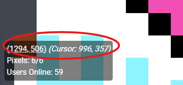
i didn’t end up getting to this before the event ended, but this should be added for next year
Alpha-blending the color you’re about to place means it’s only a correct preview when the pixel it’s over is already that color. A smaller or even circular cursor of the actual color would remain distinct from the canvas while indicating its effect more clearly.
i’ve created an issue for this so i can keep track of it 👍
thanks for the suggestion!
I personally think the whois pixel function should also show the exact coordinates of the pixel, to make it easier to find the exact spot for templates.
Unless I missed something, the only way of doing it now was using the coordinates in the bottom left and then working from there.
That’s just a minor gripe anyway, the whole thing was great, thanks for organizing it!
thanks for the suggestion, seemed to have missed that
i’m glad you enjoyed the event!
i’ve created an issue for this so i can keep track of it :)
Maybe replace Googles Captcha with an alternative like hCaptcha.
Honestly they are both pretty bad for privacy as the way that they work is a black box. At least it isn’t Cloudflare as it constantly thinks I am a bot
I agree. But at least hCaptchas don’t block you if you use more aggressive privacy-enhancing plugins and they are fun to solve (and don’t require you to find the traffic-light 20 times because your connection is a bit sus.)
And also yes, fuck Cloudflare.
I started this, and never got started: https://lemmy.ca/c/musicleague
Part of the problem was that musicleague only works with a spotify login, but it could work with a fediverse login!
MusicLeague: https://musicleague.com/user-guide/
- Each league is made up of a certain number of rounds.
- Each round has a musical theme, like ‘covers’ or ‘I want your sax.’
- When the round opens, league players are notified to submit a song that fits the theme.
- When everyone has submitted (or the submission deadline arrives), everyone receives a link to the playlist to listen, consider, and then return to Music League to assign points and add comments to reminisce, toast and maybe a gentle roast.
- Once the votes are in, everyone will be able to see the results, including who submitted what, how everyone voted, and all the comments.
- Points are earned from round to round and accumulate through the entire league until a winner is crowned.
What we can do better:
- fediverse login instead of spotify
- submit from any music service, not just spotify
- multiple playlist options, with a note for when a certain song isn’t on a service
This shouldn’t be an annual event, but rather a perpetual one
fediverse-auth (the login system running at auth.fediverse.events) is fully OpenID connect compliant so it should be pretty easy to implement into other projects
Looks really neat though!
The source for that is available on the gitlab https://git.sc07.company/sc07/fediverse-auth
First: Ta k you so much to grant and everyone else who made this project possible. I had a lot of fun, i think the problems made it even more sympathic.
One suggestion: maybe after expansion, the final canvas could be a 16:9 Format. This way its easier to find a frame for those who want to print it out. But maybe 2:1 like the actual canvas is fine too.
Im looking forward for next year :)
i’m glad you enjoyed the event, it was really fun to run (even with the issues 😅)
i’ve added your suggestion to the issue tracker so i can keep track of it
