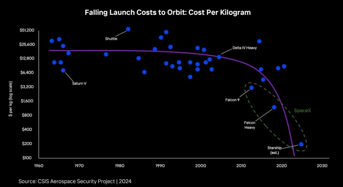
As for the estimated cost of Starship, it seems confirmed all over the internet after a quick research, with many articles(, e.g.,) speaking about an aim for a future below 10$/kg.
However, interestingly enough, the only contradiction i found came from wikipedia, since a capacity of 100.000-150.000kg for a current launch cost of $100.000.000 would imply a cost of 666-1000$ per kg.
I’ve probably made mistakes while checking all of this, so feel free to dive deeper in order to explain the differences between SpaceX’s estimates and the wikipedia page.
It’s also absurd that the fit line dives down to be cheaper and earlier than an optimistic projection that will likely move further to the top right as time progresses. That’s a chart with an agenda, not an analytical regression.
Spaceship (estimate)
An important detail is missing: whose estimate?
The chart seems to have emerged from an apparently famous report(, p.13, discussed there), whose taking its source from the Center for Strategic and International Studies, an american think tank.

As for the estimated cost of Starship, it seems confirmed all over the internet after a quick research, with many articles(, e.g.,) speaking about an aim for a future below 10$/kg.
However, interestingly enough, the only contradiction i found came from wikipedia, since a capacity of 100.000-150.000kg for a current launch cost of $100.000.000 would imply a cost of 666-1000$ per kg.
I’ve probably made mistakes while checking all of this, so feel free to dive deeper in order to explain the differences between SpaceX’s estimates and the wikipedia page.
I love such curve-fitting techniques. By 2025 we can launch 1t into space for a few cents, if we follow the purple line.
The curve would be even worse if the y-axis was linear b.t.w. 🤷
I think this actually is a linear regression plotted on a log y graph.
Which a linear regression is a bad choice for something that must be asymptotic at best.
It’s also absurd that the fit line dives down to be cheaper and earlier than an optimistic projection that will likely move further to the top right as time progresses. That’s a chart with an agenda, not an analytical regression.